During my time at Elon University, I spent a year as an Associate for the Center for Undergraduate Publishing and Information Design. My responsibilities included:
• Holding weekly consultation hours for students studying professional writing and rhetoric in the Center for Undergraduate Publishing and Information Design lab.
• Planning and facilitating professional development workshops on personal branding, resumes, cover letters, and Adobe programs.
• Creating digital content using Adobe software for local clients, including Elon University’s LGBTQIA Task Force.
• Contributing to the CUPID blog on a regular basis, covering topics ranging from grammar tips to political rhetoric
CUPID Blog
Read the full CUPID Blog posts
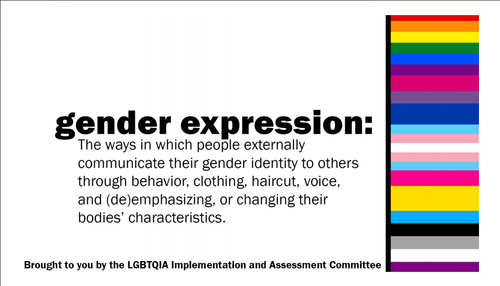
LGBTQIA Task Force Digital Boards


Rhetorical Strategies
This client project involved visual rhetoric, secondary research, and the translation view of rhetoric. The overall purpose of the digital boards is to support and include the LGBTQIA community visibly on Elon’s campus. In addition, it is simultaneously an opportunity to educate the Elon populous.
When I initially began to work on the documents, some of the design work of the flag had already been completed from a previous associate’s work. Therefore, in terms of design, the main thing left to do was to add the transgender flag to the color spectrum in order to accurately represent the entire community.
I performed a considerable amount of secondary research in order to examine the kinds of language that was being used in the definitions on a larger scale. I consulted sources like university LGBTQIA resource centers, the Human Rights Campaign, and other notable organizations centered around sexual and gender identities. Developing the right language was essential to this project because it was going to be used as an educational resource. I wanted the language to be as intentional and aware as possible.
My understanding of the translation view of rhetoric is that the effectiveness of the sender’s message or argument has a direct impact on the receiver or audience. There is a power dynamic of sorts and the sender must be aware of the fact that communication can lead to understanding or misunderstanding. In terms of the digital boards, I had to keep in mind that my language choice would effect how my audience would interpret the message.
In order to insure that the message I had produced was consistent with the mission, Professor Moore presented them to Elon’s LGBTQIA Task Force for approval. We then made some minor adjustments based on feedback from the committee, after which I began to work with InDesign.
In terms of visual design, we wanted the digital boards to have a look that was clean, easily readable, and eye-catching. It was important that the design and content were high impact. Ideally, students, teachers, and staff alike would see these broadcasted digital boards in passing.
I hoped the impact would be that of fostering responsible dialogue and educating the Elon community. Although there was a significant amount of whitespace behind the black text, it was effective because it drew attention to the definitions and contrasted nicely with the rainbow flags. By using a sans serif font and all lower case letters, I ensured that it would be easy to read in passing and that the message would be effective. I manipulated ling breaks so that there wouldn’t be any split words.
